Project Overview
Title: National Registry of EMS Redesign (2025)
Role: UX/UI Designer
Tools: Figma, Adobe Suite
Timeline: February 17 – May 11
Skills Applied: User Research, Persona Creation, User Flows, Wireframing, UI Design, Prototyping
Objective
The goal of this project was to redesign an outdated and unintuitive website for the National Registry of Emergency Medical Technicians. Stakeholders emphasized improving usability, accessibility, and mobile responsiveness to better serve a younger, tech-savvy audience entering the EMS field.
This project involved the complete UX process, from user research and persona development to wireframing and the creation of a fully functional, high-fidelity prototype in Figma. The redesign aimed to simplify navigation, improve content clarity, and ensure an accessible experience across devices.
Figma Prototype
https://www.figma.com/proto/5ZBAdCVE49UrW5YhUI4eRV/Wireframe?node-id=2-4&starting-point-node-id=2%3A4&t=bPpPdWIuXxON0fDk-1
User Research

Persona 1: Fresh High School Grad (Age 18–19)
“I want to become an EMT, but I’m not sure what steps I need to take.”
Background: Just graduated, no previous EMS experience, very mobile-dependent
Goals: Learn certification requirements, register for exams, feel confident
Frustrations: Overwhelming processes, hard-to-read site, unclear path

Persona 2: Busy Single Father (Age 30s–40s)
“I need to renew my certification quickly between work and parenting.”
Background: Experienced EMT, juggling work and parenting, time-starved
Goals: Quickly log in, renew certification, manage documents
Frustrations: Complicated login process, can’t find recert info easily, poor UX
Updated Site Navigation
The original site lacked a clear content hierarchy. Information was scattered across the page, forcing users to scroll excessively or search for links just to complete basic tasks. There was no intuitive grouping of actions, which often overwhelmed new visitors.
Before: Disorganized layout with uneven spacing and no clear structure
After: A clean top-level navigation with grouped actions like verify credentials and dropdown menus that organize certification types for faster access and better usability
After: A clean top-level navigation with grouped actions like verify credentials and dropdown menus that organize certification types for faster access and better usability

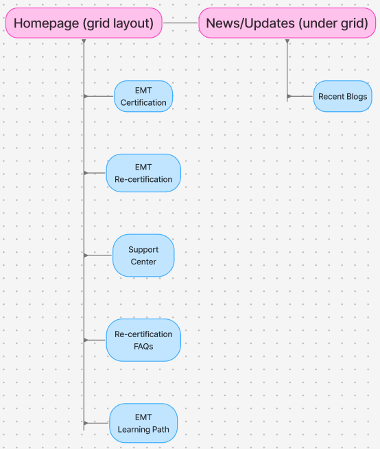
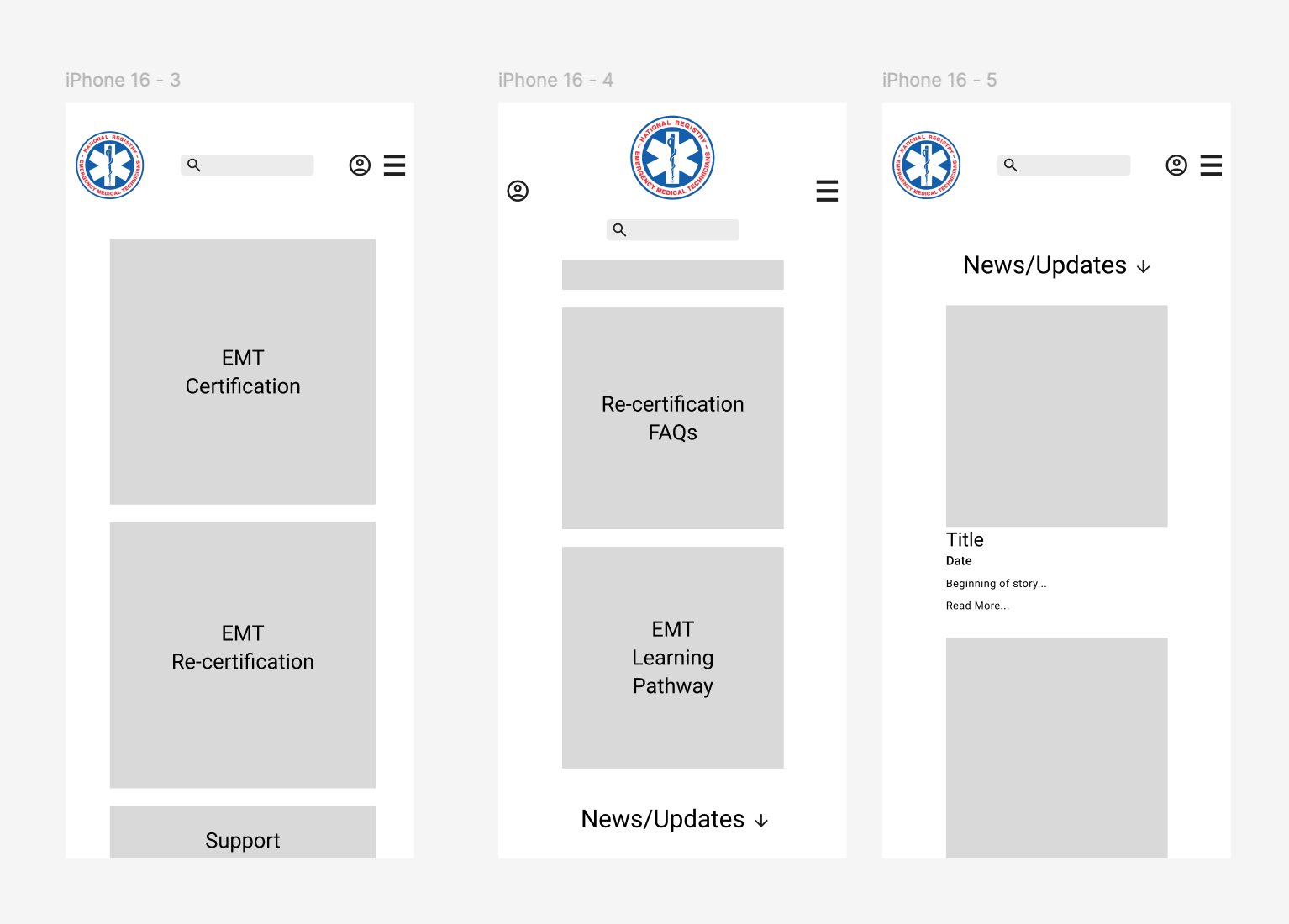
Wireframes
To explore layout, hierarchy, and task flow without visual distractions, I created these mid-fidelity wireframes in grayscale. This approach allowed me to focus on usability, content prioritization, and mobile responsiveness before introducing branding elements.
- The homepage wireframe showcases a grid layout for quick access to high-traffic pages like Re-certification FAQs and EMT Certification.
- A clear visual hierarchy guides users to the most frequently visited pages first, reducing cognitive load.
- I designed both desktop and mobile versions to ensure a consistent and intuitive experience across devices.
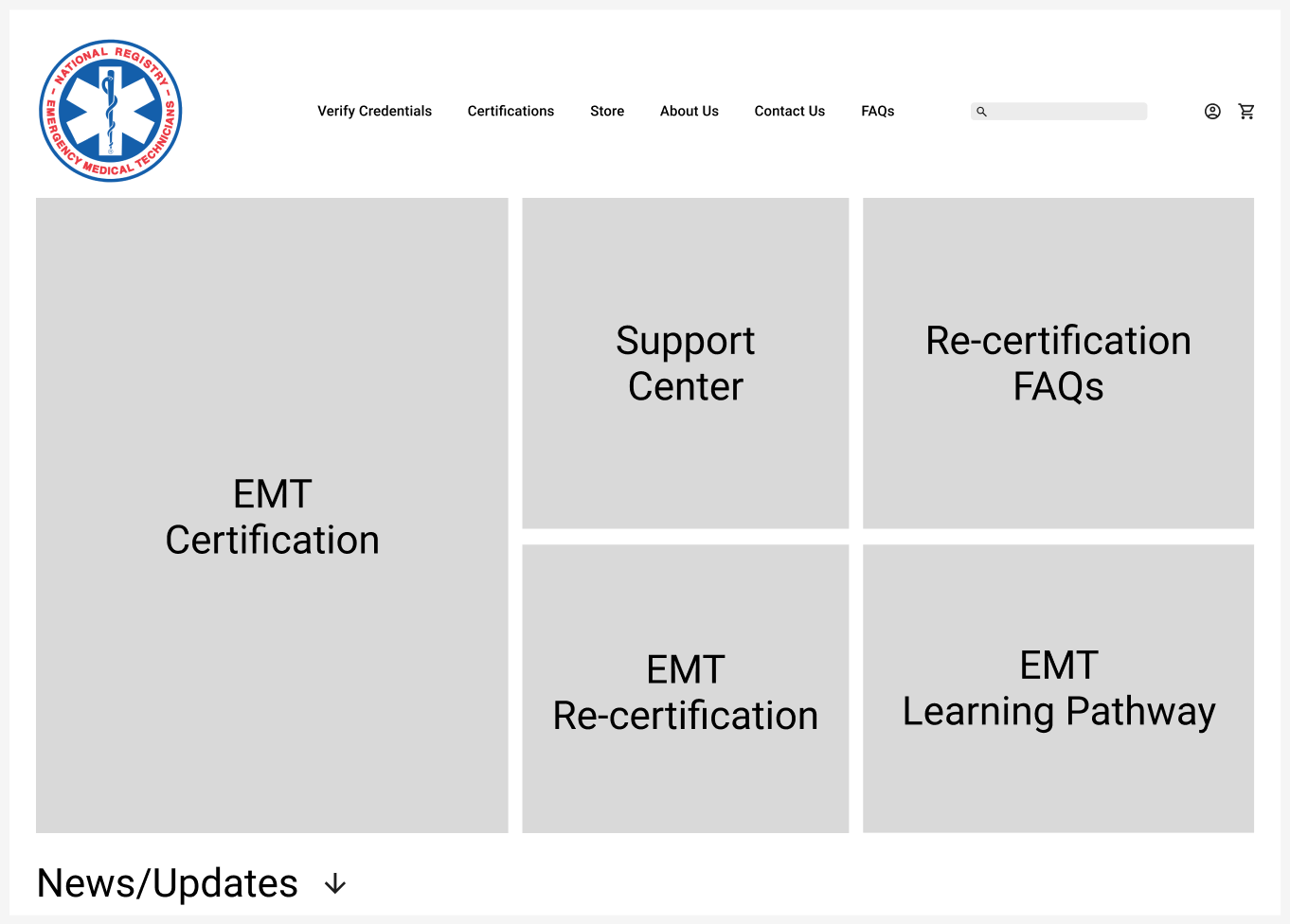


UI Design
The final UI design followed the official National Registry of EMS brand guidelines, ensuring visual consistency with their established identity while improving clarity, usability, and accessibility.
Key Design Applications
Typography: Applied approved typefaces for clear, legible content on desktop and mobile.
Color Palette: Used official colors with contrast pairings to meet WCAG-AA accessibility guidelines.
Components: Designed reusable UI elements (buttons and form fields) that match the EMS visual identity while supporting modern UX standards.


Interactive Demo
Reflection
This project challenged me to work through the full UX process, from research to high-fidelity prototyping, while staying aligned with stakeholder goals and brand constraints. One of the biggest challenges was redesigning a text-heavy website. Finding the right balance between presenting enough information for users to take action while avoiding cognitive overload required careful content prioritization, clear hierarchy, and frequent feedback. It pushed me to think critically about what users actually need at each step and how to present that in a clean, accessible way.
What I Learned
- How to apply an external brand style guide while still improving usability and clarity.
- The importance of designing with modularity and flexibility to accommodate evolving needs without disruption.
- How to communicate design decisions clearly to non-design stakeholders.
What I’d Do Differently
I would’ve conducted more in-depth usability testing or feedback rounds if I had more time, especially with real users in the EMS field
Real-World Application
One of the most valuable moments came when stakeholders requested layout changes to the homepage late in the process. Because I had built the layout on a flexible grid, I was able to make the updates quickly and cleanly. It reinforced the value of designing systems that support rapid iteration and A/B testing. This is something I will carry into future projects.